


Achievements Highlight Partnership Innovation, Collaboration and Professionalism
Intuitive Machines landed the spacecraft Odysseus on the moon’s surface on February 22, 2024. This was the first time the United States had landed a spacecraft on the moon since 1972, more than 50 years ago! You don’t need to wait that long to make charts, graphs, and presentations for your business that are out of this world.
Enhance the effectiveness of your business visuals with Planful
Great charts and presentations are a lot less complicated than space travel, that’s for sure. You can make your charts more impactful by following these simple steps:
- Add Contex
 t
t - Avoid Clutter
- Focus Your Audience’s Attention
- Text is Your Friend
- Integrate Data
Leverage Planful to ensure a smooth and effortless process
Let's break down each of these steps in detail and talk about how to leverage Planful's Excel add-in, SpotlightXL, to make this as seamless as possible.
Add Context
In the example of the recent lunar landing, if I mention that Intuitive Machines is the first private company ever from the U.S. to successfully land on the moon, how does this change how we view this accomplishment? At first, we may have thought this was just an incredible achievement but now, we might consider all the technological, business, and political advancements it took for a private company to be allowed and able to pull this off. What does this mean for our charts? It’s important to consider who, what, and how.
- Who: Consider your audience and your relationship with your audience. The more specific you can be about who will be receiving this information, the more effective you will be at communicating. Try to think about who the decision maker is in your audience to narrow down who this information is for. Lastly, your relationship with the audience matters. If you don’t know anyone in the audience, it might be important to establish your credibility on a topic beforehand.
- What: What is it you’re really trying to communicate with your chart? Here, I’d recommend considering what action needs to be taken from the information you’re presenting. If no action can be taken, consider whether it needs to be presented. You can send “insightful” information in an email, but utilizing easy-to-interpret visualizations can drive home a point you are trying to make. If you are not trying to recommend something specific, encourage discussion about what is being presented.
- How: Consider the question: “What data is available that will help make my point?”. This will help you to think about data as supporting evidence for your argument. When considering which type of graph or chart to use, reference this great article “Data Visualization and Chart Types” by EazyBI.
Focusing on the context of your visualizations will drive home the point you are trying to make in the most effective way.
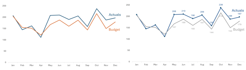
Utilize Planful Graphs to eliminate visual distractions
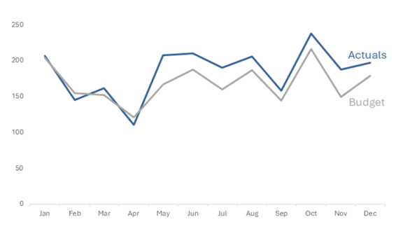
Clutter is the enemy!
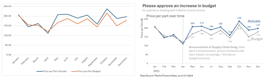
Now that we’ve figured out who our audience is, what point we’re trying to make, and how to present that point, let’s clean up our graph. Clutter is the enemy! This point is best illustrated with an example where I will highlight several steps to clean up a specific chart. While these will not apply to every single type of chart, the principles will apply broadly.
Let’s say we work for Armstrong Luna Corporation on the Financial Planning & Analysis Team. We manufacture space shuttle parts. Recently, operators have complained that their budgets have been squeezed due to inflation and are requesting more money to continue operating at a high level. You set out to examine the data and create an out-of-the-box chart. You can see there is some evidence of what the operators are saying and want to clean the chart up to present it to your managers. Let’s get started.
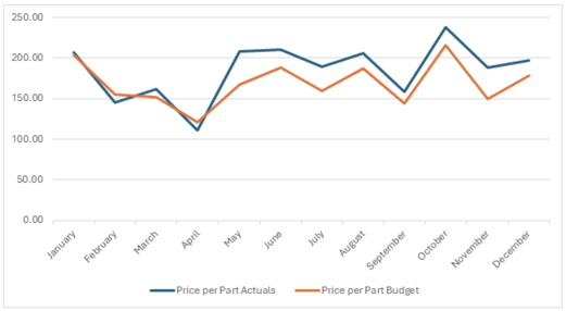
2. Next, let’s remove the gridlines. Unless your audience is going to be tracing their finger along the lines, don’t let these compete with your data.
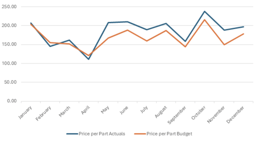
4. Let’s add labels directly next to our data, rather than using a legend. This should require less work than going back and forth or remembering the color from the legend.
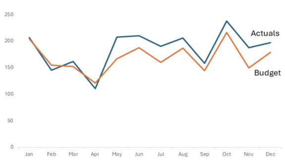
5. Lastly, let’s use consistent colors with our chart to reduce our audience’s work even more.
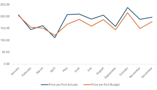
Success! While there is still more we could do with this graph, we’ve effectively reduced the clutter surrounding it and made it much easier for our audience to read.
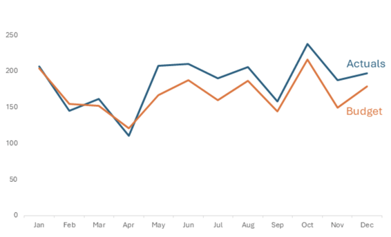
 Focus Your Audience’s Attention
Now that we’ve cleaned up our chart, let’s point our audience to something more specific. From our chart, we can see that since May, we’ve seen actuals be consistently higher than budget, so let’s emphasize that point.
1. To begin, let’s gray out the whole chart. This will help us to make a precise decision on what we want to stand out.
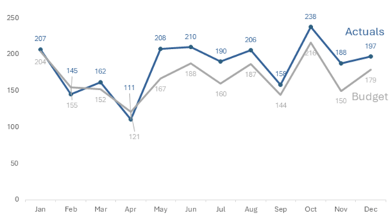
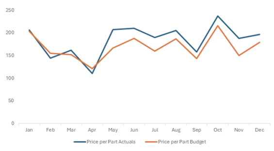
When we compare where our chart was to where it is now, our audience can clearly see what we are trying to emphasize. They are immediately drawn to our actuals standing out as the darker color. We’ve given them more detail about how large the disparity between the actuals and budget are. Lastly, we’ve drawn them to when the disparity began by ignoring the data labels in the earlier months.
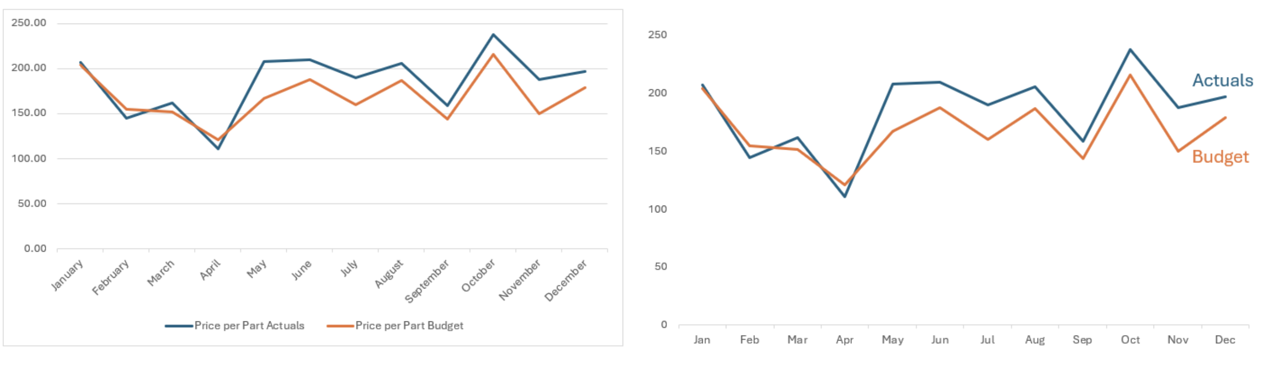
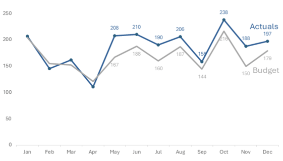
Add Text to Ensure Data Clarity and Audience Understanding to Interpret Data Better
Text is Your Friend
We’ve nearly completed our graph, but adding some text will allow your audience to use their brainpower to focus on the data itself. Never assume that everyone will come to the same conclusion when looking at your chart, so if you want them to know something, spell it out for them.
1. First, let’s tackle the basics. Add a chart tile and axis titles. Let’s add a source at the bottom as well. 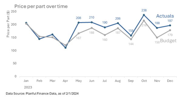
2. Let’s drive our point home now. What started us on this journey in the first place? Operators were asking for an increase in their budgets to deal with inflation. We were able to find supporting evidence of their suspicions in the data. We are now using that evidence to request a budget increase. We’re making sure our audience knows what they’re being asked and why. How? With our friend, text.
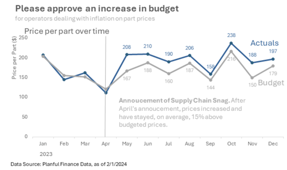
That is an interstellar graph!
Effortlessly Connect to Financial Data in Excel with Planful's Spotlight
Integrate Data
We’ve come a long way from where we started. You could say we started on earth and have reached the moon!
Okay, we might be a little shy of the ~239,000-mile journey, but we’re close! You may be thinking, “Well, this was fun, but there’s no way I can do this every week for my charts and graphs!” That’s where an EPM tool, like Planful, can come in handy.
Using Spotlight from Planful, I can have a direct connection to all my financial data in Excel. In a matter of clicks, I can drag and drop my financial dimensions (scenario like actual or budget, chart of accounts, products, etc.) into an Excel sheet and download the data. Watch below.
With my data available in this format, I can easily build a chart to start with. Even better, I can convert this view into a report that I can distribute along with my presentation. Using something called a substitution variable, I can update this report with one click when the next month’s data becomes available. This would flow through to my chart, and I can instantly see how we are tracking compared to the budget. From there, I can continue to follow the principles we learned today to focus my audience’s attention and use text as a friend to craft a story behind our data.
Off to the Moon with Planful
Don’t wait another 50 years to make your charts, graphs, and presentations extraterrestrial. We can follow the simple steps of adding context, avoiding clutter, focusing our audience’s attention, using text as our friend, and integrating data to effectively communicate a story and trigger action from our data. I am confident that you will hear the cheers of success from your team and organization by embarking on this endeavor to master data visualization seamlessly and easily.
CFO Solutions specializes in implementing multiple EPM solutions (Planful, Oracle, Board, OneStream) to help finance teams succeed in automating many regular finance activities and give you more time to focus on data-driven analysis and reporting for your organization.
When you’re ready to take your visualizations to another planet, contact us about integrating your EPM solution with Power BI to create interactive and masterful presentations and reports.
If you need help in crafting stunning visuals like this, book time to meet us!
Footnotes:
- https://www.cnet.com/science/space/odysseus-lunar-lander-sent-a-farewell-photo-of-earth-now-what/
- “Storytelling with Data” by Cole Nussbaumer Knaflic
- https://eazybi.com/blog/data-visualization-and-chart-types#:~:text=Bar%20charts%20are%20good%20for,never%20for%20comparisons%20or%20distributions.
- https://www.rmg.co.uk/stories/topics/how-far-away-moon#:~:text=How%20far%20away%20is%20the%20Moon%20from%20the%20Earth%3F,km%20(238%20855%20miles)


